

This is a continuation of the “Chahak” article series.
This article outlines the process of making a markdown text editor in Angular, which allows the user to enter markdown text and apply some basic formatting.
Design Decisions
The following questions need to be answered before diving into the implementation: -
How should the text input be taken?
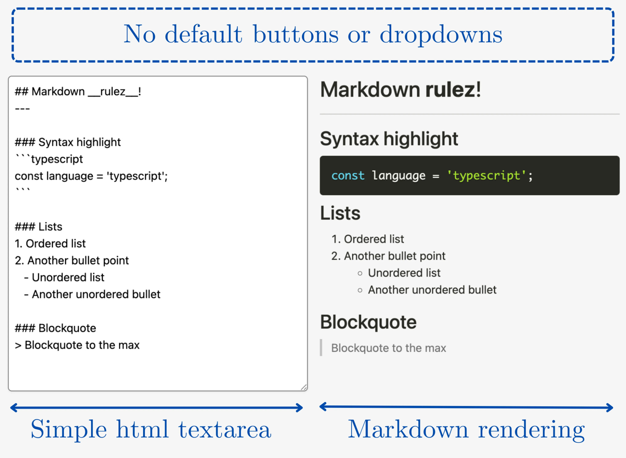
Markdown input is in the form of plain text. Thus, a simple HTML textarea can be used to take the input.
In what form are the styles that are applied taken as input?
A class
Stylecan be defined that uses various attributes to store the formatting of a particular article.How is the text input and style combined to create an output?
Markdown text can be converted to HTML. Then, the values of the
Styleobject can be used to apply CSS properties to the HTML text.How do I convert the markdown to its respective HTML representation?
A parser would be required to convert Markdown to HTML.
How to format portions of the text (for example, just the paragraphs, or just the tables) without applying the same formatting to the entire text?
The
Styleclass could be associated with tag-wise styles. For this, another class calledTagcould be defined which stores information specific to each different tag.
Then there were also decisions about how the content should be laid out visually.
For example, for those of you familiar with Overleaf, the software that allows collaboration while writing LaTeX has a split-screen view that allows you to see latex code and the respective rendering side by side.
However, unlike markdown, latex must be compiled before the render can be updated. So, one cannot actively see the render update as the code is changed.
In terms of the text formatting tools provided, the Google Docs toolbar served as a better design to follow. The tools are more clearly visible and organised. This would also serve as a good template since I tend to use the Angular Materials library for my Angular projects, which would lead to a similar aesthetic as Google’s user interfaces.

Currently Available Solutions
I went ahead and tried out some existing markdown editor components available for Angular. A simple Google search results in several decent markdown editor components that provide all the relevant text formatting features that you might expect and an overall professional-looking user interface (for example, this one provided by Sync fusion). But very quickly, I realised that I probably will not be able to use any of the more robust solutions out of the box. This was because: -
On using a complete solution provided by a third party, I will have to adjust to the way they provide outputs and the inputs they expect, since the implementation of the component will be a black box.
The user interfaces that might be provided may not match the design language of the rest of the website. While this is not a very severe concern, it does make things look odd.
So, instead, I used ngx-markdown, which provides a simple mechanism to parse markdown text and give an HTML output that can be rendered for preview. Additionally, the output HTML templates for each type of HTML tag (such as headings, tables, images, etc.) can be customised. It does not provide any other interfaces such as buttons to format text, text alignment options and more. This, in a way, is beneficial because I could make those parts myself to keep the user interface homogenous across the website and text editor.
Necessary Changes
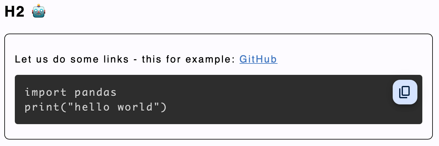
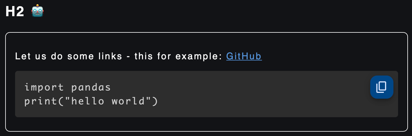
As you can see in the image above, right out of the box, the output is a satisfactory one. However, there were certain things I wished to add for my use case.
A font selector: I wanted to provide a way to choose fonts, but did not want to incorporate a large library of fonts. So I instead chose to provide three simple choices - Monospace, Slab and Serif. For most documents, one of these three choices would be enough to settle one’s aesthetic taste.
Text alignment: While most documents are left-aligned, at the time, providing the other three text alignment options did not seem like much additional work. Each tag type can be aligned separately, such that all tags of a certain type are similarly aligned.
Text colour
Text highlight colour
Page colour
Horizontal rule colour
Text size
Editor view options: Allowing a user to view the edit panel and preview panel either in a split-screen fashion or only one or the other.
Each of these would visually translate into some input button or dropdown. The interaction with these interfaces would result in the respective changes to be made in terms of the styles to be added to the output HTML.
Implementation
Data Models
The addition of these components leads to one complication. Now, three different parts - the user interface, the text input and the rendering component - would have to be able to communicate the style being applied with each other. For this, I created a standard representation for these styles.
export class Style {
  h1:Tag = new Tag("h1");
  h2:Tag = new Tag("h2");
  h3:Tag = new Tag("h3");
  h4:Tag = new Tag("h4");
  h5:Tag = new Tag("h5");
  h6:Tag = new Tag("h6");
  p:Tag = new Tag("p");
  ol:Tag = new Tag("ol");
  ul:Tag = new Tag("ul");
  table:Tag = new Tag("table");
  a:Tag = new Tag("a");
  blockquote:Tag = new Tag("blockquote");
  baseSize: number = 1;
  sizeUnit: string = "em";
  backgroundColor: string = "transparent";
  parent: string = "markdown";
  code:Tag=new Tag("code");
  blockquoteStyle="round";
  hrColor: string="black";
}

export class Tag {
  name: string= "";
  color: string = "#000000";
  backgroundColor: string = "transparent";
  font: string = "sans-serif";
  align: string = "center";

  constructor(name:string, color:string="", backgroundColor:string="", font:string="", align:string="") {
    this.name = name!="" ? name : this.name;
    this.color = color!="" ? color : this.color;
    this.backgroundColor = backgroundColor!="" ? backgroundColor : this.backgroundColor;
    this.font = font!="" ? font : this.font;
    this.align = align!="" ? align : this.align;
  }
}
The
Styleclass represented the template for the entire document’s overall style settings.By maintaining
Tagobjects for each HTML tag, theStyletemplate could keep track of a unique set of style attributes for each category of tags.In addition to styles that correspond to a particular tag, other styles such as the entire page’s background colour, colour of the horizontal rule etc., are also set in the
Styleclass.
Service for Syncing Style Inputs
Thus, this Style class can be modified by each of the three components via an EditService to maintain a common view of the final applied styles.
export class EditService {

	/*
	Local variable definitions go here
	(For example the edit service might maintain the master copy
	of the text inputted by the user and also the master copy
	of the styles applied.)
	*/

	// Getter and setter for getting text
  getMdText() {
    ...
  }
  setMdText(text: any) {
    ...
  }

  // Getter and setter for getting the style object
  getMdStyle() {
    ...
  }
  setMdStyle(style: any) {
    ...
  }

  // Getter and setter for the view mode set (edit/preview/splitscreen)
  getMode() {
    ...
  }
  setMode(val:string) {
    ...
  }

  // Get a particular `Tag` object from the master `Style` object based on the input string.
  getTag(name:String) : Tag|null {
    ...
  }

  // Get a list of strings where each string is the name of tag. This is used to populate options in the toolbar dropdown.
  getTags() {
    ...
  }

  // Get a list of fonts provided and is also used to populate the drop downs.
  getFonts() {
    ...
  }

  // List of alignments for populating drop down.
  getAligns() {
    ...
  }

  // Get the correct css style according to the input font
  getFont(name:string) : string|null {
    ...
  }

  // Use the blockquote tag settings populated in the input `Tag` object to return the correct css style.
  // The reason for a separate function to parse blockquotes alone is because I also
  // handle the modification of border styles which is unlike other tags.
  parseBlockquote(tag: Tag, parent:string = "") {
    ...
  }

  // Parse an <a> tag
  parseA(tag: Tag, parent:string = "") {
    ...
  }

  // Parse the remaining tags using the settings in the `Tag` object.
  parseTag(tag: Tag, parent:string = "") {
    ...
  }

  // Return the complete css to be applied while also using the results of the above parse methods.
  parse() {
    ...
  }
}
Using the methods in the EditService the three components involved in the text input, styling and rendering processes can share the necessary changes with each other.
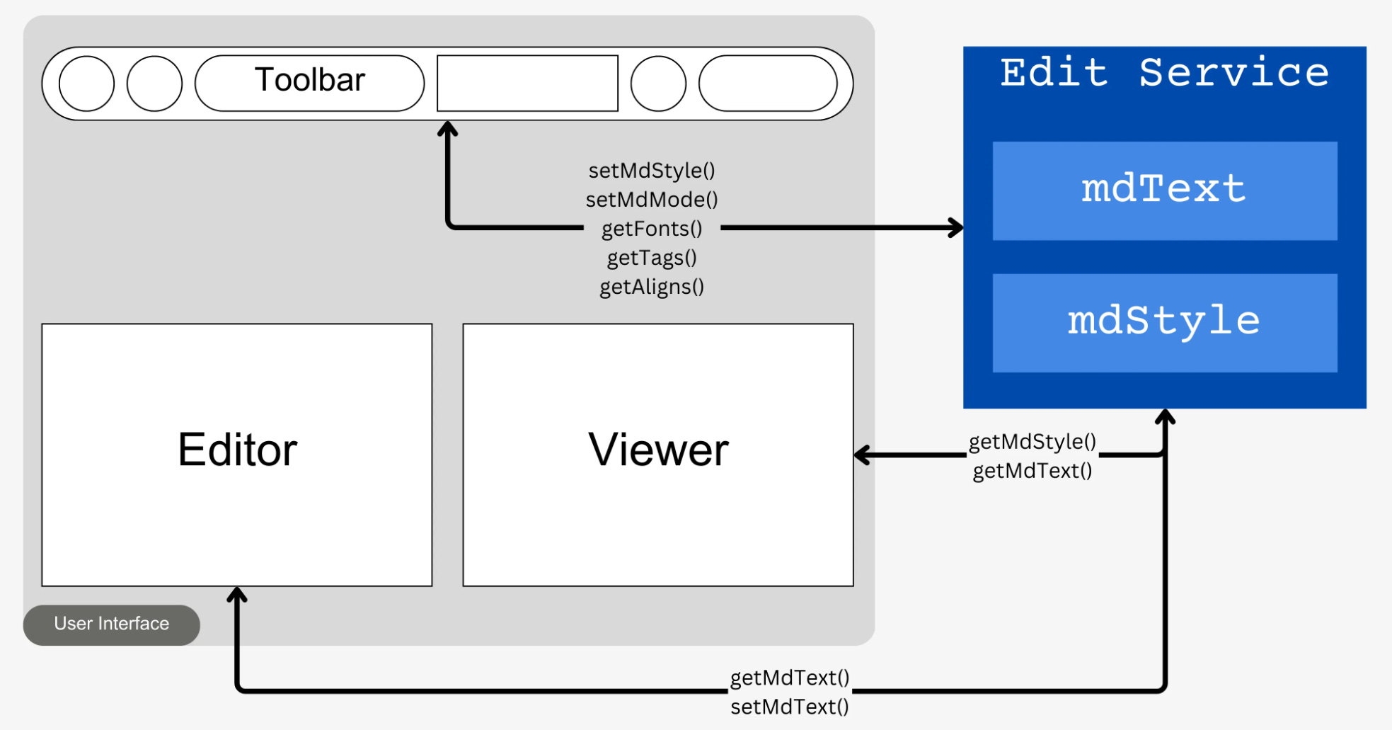
EditService. The service maintains the text content being entered and the style settings which are modified or fetched by the other components using getters and setters.Components
Now, the user interface for the editor has to be made. The editor is composed of a toolbar, an editor and a viewer. Each of these parts makes up one component.
EditorComponent
editor.component.html
A simple
<textarea>is used to take markdown text input.The
change()method is activated whenever an input event is detected on the component. The value entered is stored in theEditServiceusingthis.editService.setMdText().The HTML style of the textarea is set using the
editorStyle()method. This is used to adjust the visibility of the text editor based on the view mode that the user chooses.
<textarea [(ngModel)]="text" (input)="change($event)" [style]="editorStyle()"></textarea>
editor.component.ts
@Component({
  selector: 'app-editor',
  standalone: true,
  imports: [
    FormsModule
  ],
  templateUrl: './editor.component.html',
  styleUrl: './editor.component.css'
})
export class EditorComponent {
  editorWidth: string = "100%"; /* The width of the editor that will be applied using CSS. */
  constructor(private editService: EditService) {} /* The EditService is injected to be able to set the markdown text values in the service */
  text: string = ""; // Stores the text value that is present in the editor

  ngOnInit() {
    this.editService.getMdText().subscribe(text => { /* Subscribe to the text value in EditService */
      this.text = text; /* The value from the service is synced with the value in the editor */
    })
  }

  change(event:any){
	  /* When a character in the textarea is changed, the event is relayed to the service */
    this.text = event.target.value;
    this.editService.setMdText(this.text)
  }

  toggleEditor() {
	  /* Toggle the width of the editor */
    if (this.editorWidth == "100%") {
      this.editorWidth = "0";
    }
    else {
      this.editorWidth = "100%"
    }
  }

  editorStyle() {
	  /* Apply the width value as CSS on the textarea */
    return `width: ${(this.editorWidth)}`
  }
}
editor.component.css
CSS for this component is basic. It mostly involves adjusting the height and width of the editor, along with some basic font settings.
textarea {
  border: none;
  height: 100%;
  resize: vertical;
  font-size: 1.5em;
}
ViewComponent
view.component.html
The <markdown> tag comes from the ngx-markdown library which we will use for rendering the HTML produced from the input markdown. Some plugins provided by the library have been used here: -
clipboard: Provides a button to copy code in code blocks.katex: Enables LaTeX math rendering.emoji: Activates an emoji toolkit that allows rendering images using short names such as:heart:.ngPreserveWhitespaces: This is used to preserve all whitespaces, such as newlines and not strip them from the input markdown. This is necessary for long-form content.lineNumbers: Enable line numbering inside code blocks.mermaid: It enables rendering of mermaid diagrams.
The data property binding is used to input markdown text into the component.
<div class="markdown-container">
	<markdown
	clipboard
	katex
	emoji
	ngPreserveWhitespaces="true"
	lineNumbers
	mermaid
	[data]="this.text">
	<!--[src]="'<https://cdn.jsdelivr.net/npm/mermaid@10.9.1/dist/mermaid.min.js>'"-->
	</markdown>
</div>
To enable some of these plugins, the following have to be added to angular.json
{
	"styles": [
    "src/styles.css",
    "node_modules/katex/dist/katex.min.css",
    "node_modules/prismjs/themes/prism-okaidia.css",
    "node_modules/prismjs/plugins/line-numbers/prism-line-numbers.css"
  ],
  "scripts": [
    "node_modules/katex/dist/katex.min.js",
    "node_modules/katex/dist/contrib/auto-render.min.js",
    "node_modules/emoji-toolkit/lib/js/joypixels.min.js",
    "node_modules/clipboard/dist/clipboard.min.js",
    "node_modules/mermaid/dist/mermaid.min.js",
    "node_modules/prismjs/prism.js",
    "node_modules/prismjs/components/prism-python.min.js",
    "node_modules/prismjs/plugins/line-numbers/prism-line-numbers.js"
  ]
},
"node_modules/katex/dist/katex.min.css","node_modules/katex/dist/katex.min.js"and"node_modules/katex/dist/contrib/auto-render.min.js"are required for thekatexplugin."node_modules/prismjs/themes/prism-okaidia.css"is used to provide the colour theme for the rendered code block. More themes are available here."node_modules/prismjs/plugins/line-numbers/prism-line-numbers.css"and"node_modules/prismjs/plugins/line-numbers/prism-line-numbers.js"are required to enable line numbers in the rendered code blocks."node_modules/emoji-toolkit/lib/js/joypixels.min.js"enables the emojis."node_modules/clipboard/dist/clipboard.min.js"enables the clipboard feature."node_modules/mermaid/dist/mermaid.min.js"enables mermaid diagrams."node_modules/prismjs/components/prism-python.min.js"enables syntax highlighting for code blocks written in Python. For any additional language, the corresponding JavaScript file has to be included to enable syntax highlighting."node_modules/mermaid/dist/mermaid.min.js"enables the mermaid plugin.
view.component.ts
The
MarkdownComponentis added to theimportslist of the component and is used to render the HTML result.Like in the
EditorComponent,EditServiceis injected into this component.Along with the markdown text provided by the service, this component also subscribes to the style value stored in the service.
The
textvariable stores the local copy of the markdown text, which is populated from the service’s subscribed value. Thestylevariable does the same for the style value.
@Component({
  selector: 'app-view',
  standalone: true,
  imports: [MarkdownComponent, MatButtonModule],
  templateUrl: './view.component.html',
  styleUrl: './view.component.css',
  preserveWhitespaces: true,
  encapsulation: ViewEncapsulation.None,
})
export class ViewComponent {
  text="hello world";
  style = new Style();
  constructor(private _router: Router, private editService: EditService) {}
  ngOnInit() {
	  // Get service's markdown text value
    this.editService.getMdText().subscribe(text => {
      this.text = text;
    })

    // Get service's markdown style value
    this.editService.getMdStyle().subscribe(style => {
      this.style = style;
      const head = document.getElementsByTagName('head')[0];
      const tempstyle = document.createElement('style');
      tempstyle.type = 'text/css';

      // The style value is appened to the head tag of the document as a style tag
      tempstyle.appendChild(document.createTextNode(this.editService.parse()));
      head.appendChild(tempstyle);
    })
  }
}
view.component.css
In the CSS file for this component, the default styles to be rendered are set along with the necessary default values for the CSS variables. These classes are applied at the time of rendering in the EditService.
@import url("<https://fonts.googleapis.com/css2?family=Noto+Serif:ital,wght@0,100..900;1,100..900&family=Roboto+Mono:ital,wght@0,100..700;1,100..700&family=Roboto+Slab:wght@100..900&display=swap>");
:root {
  --white: #F3EFE0;
  --grey: #434242;
  --black: #222222;
  --blue: #22A39F;
  --yellow: #F3CA52;
  --purple: #8E8FFA;
  --roboto-mono: "Roboto Mono", monospace;
  --roboto-slab: "Roboto", sans-serif;
  --noto-serif: "Noto Serif", serif;
  --base-size: 1em;
  --radius: 0.5em; }

.markdown-container {
  padding: 1em;
  font-family: var(--noto-serif);
  line-height: calc(1.2*var(--base-size));
  background-size: cover;
  overflow-wrap: break-word;
  }

markdown h1, markdown h2, markdown h3, markdown h4, markdown h5, markdown h6 {
  color: var(--blue);
  font-family: var(--roboto-slab);
  padding: 0.25em;
}
markdown a {
  text-decoration: none; }
markdown a:hover {
  text-decoration: none; }
markdown code {
  padding: calc(0.05*var(--radius));
  margin: calc(0.45*var(--radius));
  border-radius: var(--radius);
  font-family: var(--roboto-mono);
  background-color: var(--grey); }
markdown pre > code {
  display: block;
  padding: var(--radius); }
markdown blockquote {
  padding: var(--radius); }
markdown img {
  max-width: 80%;
  margin: auto;
  display: block; }
markdown table, markdown tr, markdown td, markdown th {
  border: 1px solid var(--white);
  border-collapse: collapse;
  padding: var(--radius); }
markdown table {
  width: 100%;
  margin: auto; }
hr {
  border: 1px solid;
}
HomeComponent
home.component.html
<mat-card>
  <mat-card-content>

	  <!-- Toolbar -->
    <div class="toolbar-items">

	    <!-- Menu item to choose HTML tag -->
      <mat-form-field class="styler" appearance="outline">
        <mat-label>
          <span class="material-symbols-outlined">
          tag
          </span>
        </mat-label>
        <mat-select [(value)]="selectedTag">
	        <!-- Display all available tags in the menu -->
          @for (tag of this.editService.getTags(); track tag) {
            <mat-option value="{{tag}}">{{ tag }}</mat-option>
          }
        </mat-select>
      </mat-form-field>

      <!-- Choose font style -->
      <mat-form-field class="styler" appearance="outline">
        <mat-label>
          <span class="material-symbols-outlined">
          font_download
          </span>
        </mat-label>
        <!-- This menu item is only enabled if a tag is selected -->
        <mat-select [(value)]="selectedFont" (selectionChange)="changeFont()" [disabled]="this.selectedTag==''">
	        <!-- List of all fonts is fetched from service -->
          @for (tag of this.editService.getFonts(); track tag) {
            <mat-option value="{{tag}}">{{ tag }}</mat-option>
          }
        </mat-select>
      </mat-form-field>

      <!-- Choose text alignment -->
      <mat-form-field class="styler" appearance="outline">
        <mat-label>
          <span class="material-symbols-outlined">
          subject
          </span>
        </mat-label>
        <!-- This menu item is only enabled if a tag is selected -->
        <mat-select [(value)]="selectedAlign" (selectionChange)="changeAlign()" [disabled]="this.selectedTag==''">
          <mat-select-trigger><mat-icon class="material-symbols-outlined align-icon">format_align_{{selectedAlign}}</mat-icon></mat-select-trigger>
            @for (tag of this.editService.getAligns(); track tag) {
              <mat-option value="{{tag}}" >
              <span class="material-symbols-outlined">
                format_align_{{ tag }}
              </span>
              </mat-option>
            }
        </mat-select>
      </mat-form-field>

      <!-- Choose text colour of selected tag -->
      <label>
        <span class="material-symbols-outlined">
          format_color_text
        </span>
      </label>
      <!-- This menu item is only enabled if a tag is selected -->
      <input type="color" class="styler" [value]="this.editService.getTag(selectedTag)?.color" (change)="changeTextColor($event)" [disabled]="this.selectedTag==''">

      <!-- Choose text background colour of selected tag -->
      <label>
        <span class="material-symbols-outlined">
          format_ink_highlighter
        </span>
      </label>
      <!-- This menu item is only enabled if a tag is selected -->
      <input type="color" class="styler" [value]="this.editService.getTag(selectedTag)?.backgroundColor" (change)="changeTextBGColor($event)" [disabled]="this.selectedTag==''">

			<!-- Choose page background colour -->
      <label>
        <span class="material-symbols-outlined">
          format_color_fill
        </span>
      </label>
      <input type="color" class="styler" [value]="this.style.backgroundColor" (change)="changeColor($event)">

			<!-- Choose horizontal rule colour -->
      <label>
        <span class="material-symbols-outlined">
          horizontal_rule
        </span>
      </label>
      <input type="color" class="styler" [value]="this.style.hrColor" (change)="changeHRColor($event)">

      <!-- Choose base font size -->
      <mat-form-field class="styler" appearance="outline">
        <mat-label>
          <span class="material-symbols-outlined">
          format_size
        </span>
        </mat-label>
        <input matInput type="number" class="styler" [value]="this.style.baseSize" (change)="changeSize($event)" >
      </mat-form-field>

      <!-- Set of menu items that are only enabled if the selected tag is a blockquote -->
      @if (this.selectedTag === "blockquote")
      {<div>
		      <!-- Choose whether the blockquote's border is rounded or sharp -->
          <mat-button-toggle-group #group="matButtonToggleGroup" value={{this.style.blockquoteStyle}} (change)="changeBorder(group.value)" >

            <mat-button-toggle value="round">
              <mat-icon class="material-symbols-outlined">rounded_corner</mat-icon>

            </mat-button-toggle>
            <mat-button-toggle value="sharp">
              <mat-icon class="material-symbols-outlined">border_style</mat-icon>

            </mat-button-toggle>
          </mat-button-toggle-group>
        </div>}

      <!-- Choose the mode of visibility of the editor -->
      <div>
        <mat-button-toggle-group #group="matButtonToggleGroup" value={{this.mode}} (change)="changeMode(group.value)">
          <mat-button-toggle value="edit">
            <mat-icon class="material-symbols-outlined">edit</mat-icon>
            Edit
          </mat-button-toggle>
          <mat-button-toggle value="preview">
            <mat-icon class="material-symbols-outlined">preview</mat-icon>
            Preview
          </mat-button-toggle>
          <mat-button-toggle value="both">
            <mat-icon class="material-symbols-outlined">splitscreen_landscape</mat-icon>
            Splitscreen
          </mat-button-toggle>
        </mat-button-toggle-group>
      </div>
    </div>
    <mat-divider></mat-divider>

    @if(this.selectedTag=='')
    {<h3 style="color: indianred"><em>Select a tag</em></h3>}

    <!-- Show the editor or view window or both the windows based on the visibility mode chosen -->
    <div class="editors">
      @if (this.editorVisible()) {
        <app-editor></app-editor>
      }
      @if (this.viewerVisible()) {
        <app-view></app-view>
      }
    </div>
  </mat-card-content>
</mat-card>
home.component.ts
Here, the logic to relay all the toggle/click actions defined in the HTML file to the EditService is defined. Accordingly, the service is injected.
Any method that is called on the above toggle/click actions first modifies the local copy of the styles and then communicates those changes through the service.
@Component({
  selector: 'app-home',
  standalone: true,
  imports: [
    EditorComponent,
    ViewComponent,
    MatButtonModule,
    MatCardModule,
    MatDividerModule,
    MatCheckboxModule,
    FormsModule, ReactiveFormsModule,
    MatSelectModule,
    MatFormFieldModule,
    MatIconModule,
    MatButtonToggleModule, MatInputModule
  ],
  templateUrl: './home.component.html',
  styleUrl: './home.component.css'
})
export class HomeComponent {
  style:Style = new Style();
  selectedTag = '';
  selectedAlign = '';
  selectedFont: string = "";
  mode = ""

  constructor(public editService: EditService) {}

  ngOnInit() {
    this.editService.getMdStyle().subscribe(style => {
      this.style = style
    })
    this.mode = this.editService.getMode()
  }
  changeColor(event: any) {
    this.style.backgroundColor = event.target.value;
    this.editService.setMdStyle(this.style)
  }
  changeTextColor(event: any) {
    this.editService.getTag(this.selectedTag)!.color = event.target.value;
    this.editService.setMdStyle(this.style)
  }
  changeTextBGColor(event: any) {
    this.editService.getTag(this.selectedTag)!.backgroundColor = event.target.value;
    this.editService.setMdStyle(this.style)
  }
  changeAlign() {
    var tag = this.editService.getTag(this.selectedTag)
    tag!.align = this.selectedAlign;
    this.editService.setMdStyle(this.style)
  }
  changeFont() {
    var tag = this.editService.getTag(this.selectedTag)
    tag!.font = this.editService.getFont(this.selectedFont)!;
    this.editService.setMdStyle(this.style)
  }
  changeSize(event: any) {
    this.style.baseSize = event.target.value;
    this.editService.setMdStyle(this.style)
  }
  changeMode(mode: string) {
    this.editService.setMode(mode)
    this.mode = mode;
  }
  editorVisible() {
    return this.editService.getMode() !== "preview"
  }
  viewerVisible() {
    return this.editService.getMode() !== "edit"
  }
  changeBorder(value: string) {
    this.style.blockquoteStyle = value;
    this.editService.setMdStyle(this.style);
  }
  changeHRColor(event: any) {
    this.style.hrColor = event.target.value;
    this.editService.setMdStyle(this.style);
  }
}
home.component.css
The container of the EditComponent and ViewComponent has the class editors. The container is a flex box. The align-items: stretch and align-content: stretch properties are used to make the items in the container expand to fill up empty spaces. Thus, if either the EditComponent or ViewComponent is shrunk to a 0% width, the other one will expand to full width to occupy the full screen. This makes it possible to enable and disable the split screen.
.editors > * is used to apply styles to the EditComponent and ViewComponent which are present within the div labelled with the .editors class. overflow: hidden prevents text from crossing the boundaries of these divs. overflow-y: scroll allows each div to be independently scrolled in the vertical direction.
.editors {
  display: flex;
  flex-direction: row;
  width: 100%;
  height: 80vh;
  align-items: stretch;
  align-content: stretch;
}
.editors > * {
  overflow: hidden;
  overflow-y: scroll;
  flex-grow: 1;
  width: 50%;
}
.styler {
}
.toolbar-items {
  display: flex;
  flex-direction: row;
  gap: 1em;
  align-items: baseline;
  height: fit-content;
}
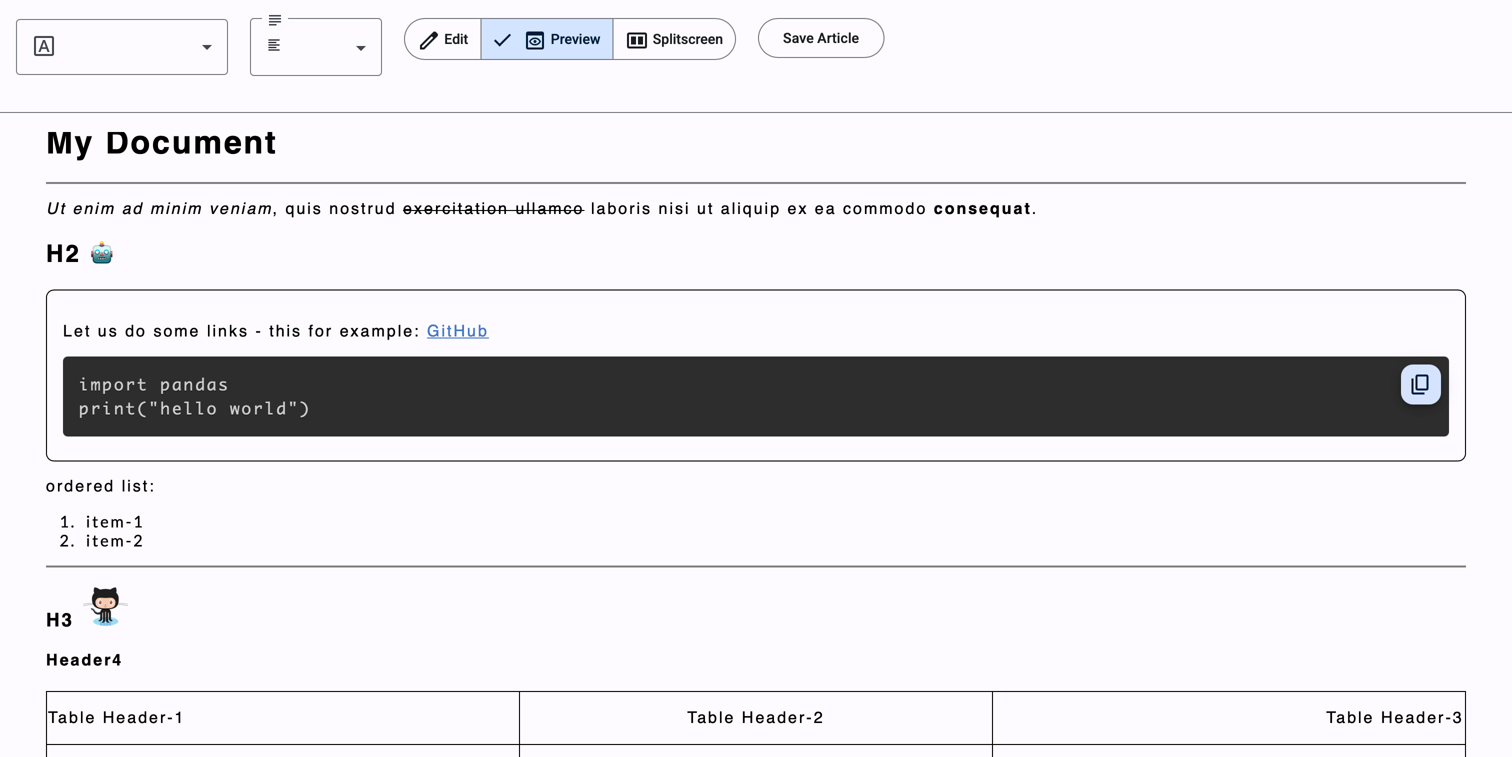
End Result
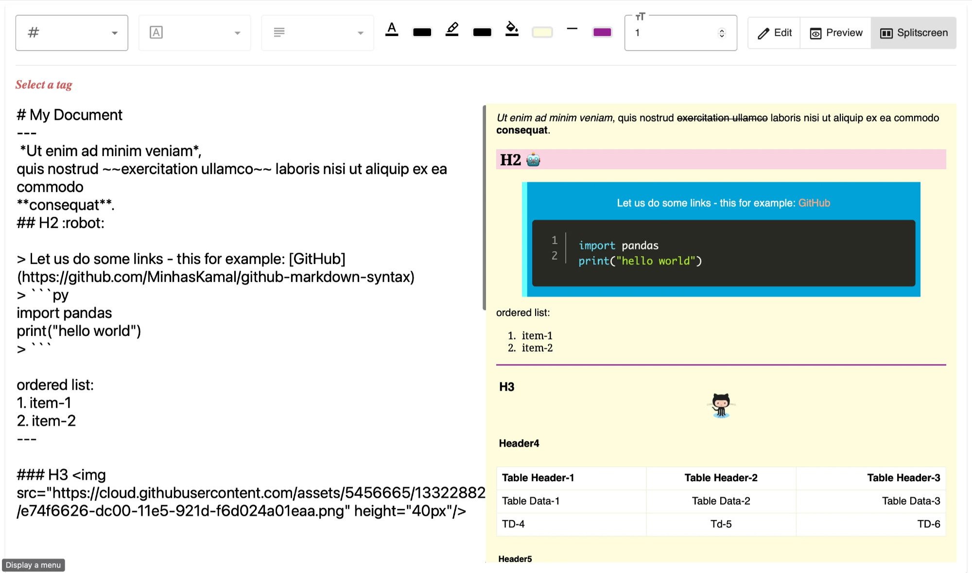
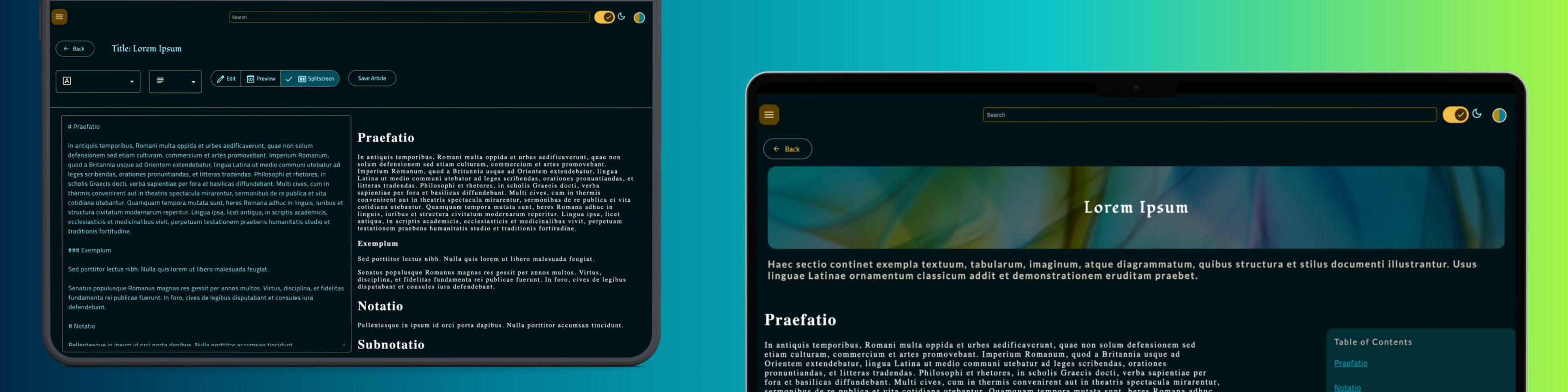
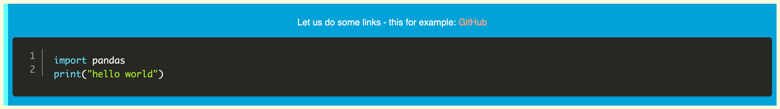
As seen in the above image, the result is simple consisting of three components - the top toolbar that contains different formatting options such as font choices, alignment choices, text colours, text highlight colours, page colour, horizontal rule colour, the base text size, and view options; the editor which is a simple html <textarea> that is used to input markdown text, and the output preview, which is rendered with the help of the ngx-markdown component and also reflects the styles that are selected from the toolbar.
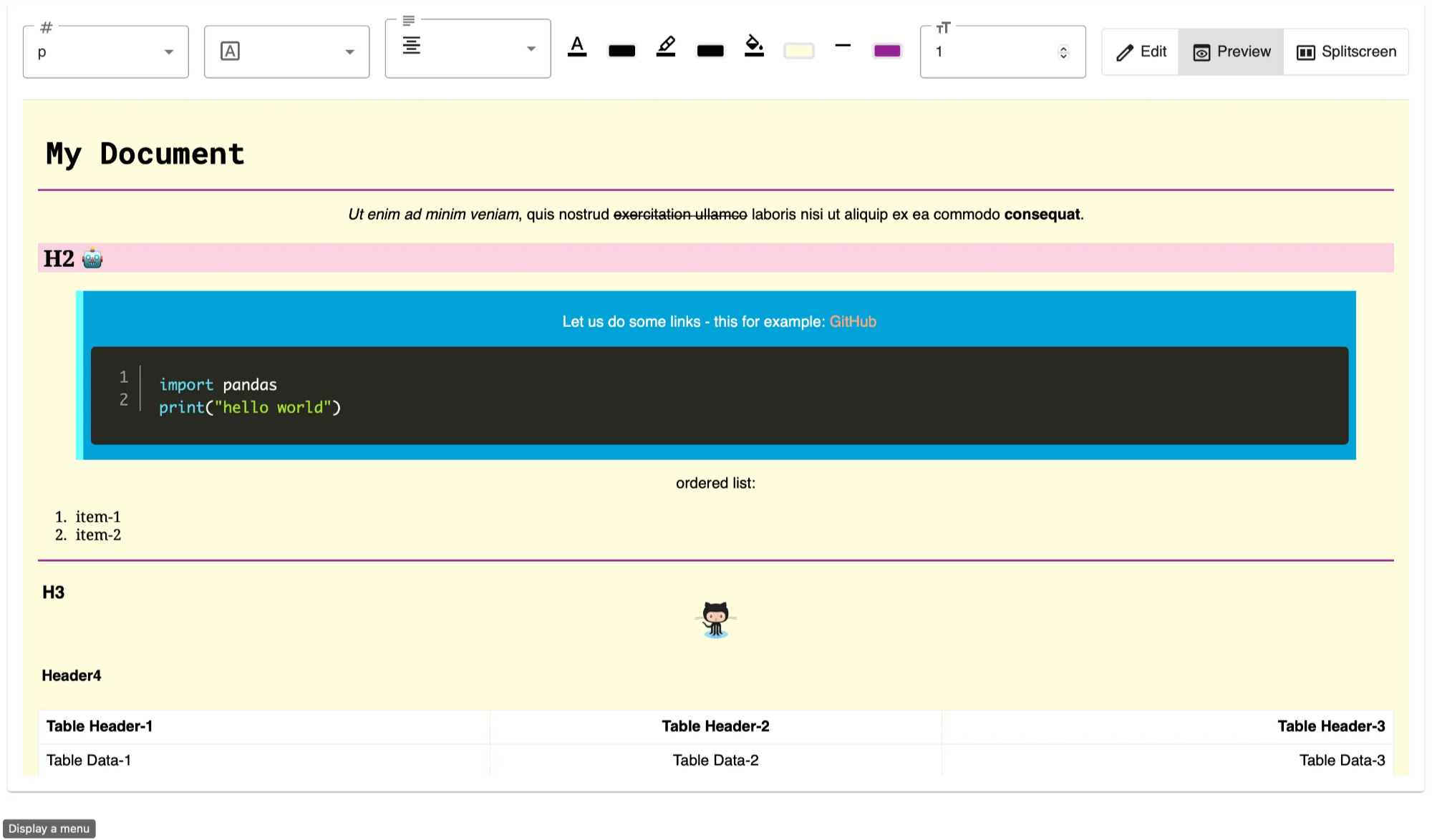
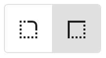
The content can be previewed in full screen by adjusting the view options on the top right. Additionally, the renderer also supports rendering tabulated content, images, URLs and block quotes. There is an additional option to change the style of border rendered for a blockquote: -
That is possible by the addition of a single toggle that maps to another attribute in the Style object.
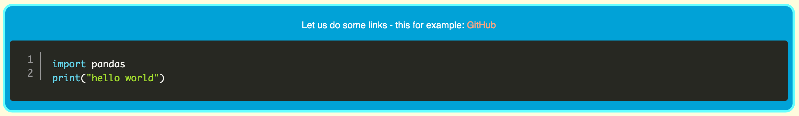
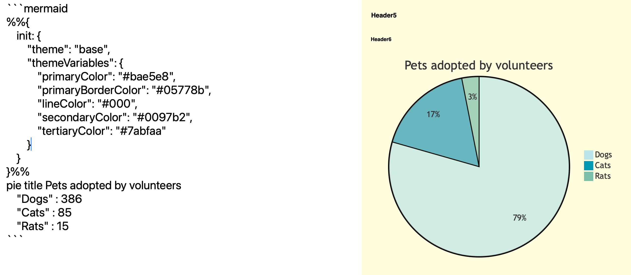
Additionally, diagrams made through mermaid code can also be rendered along with customisation in the diagram colours: -
For uniformity in design, I used Angular Material Design for the toolbar, the selectors within the toolbar and all other visual components.
The final product looks as shown below.
What Remains?
On its own, this text editor is pointless. All it does is keep the text and styles currently being edited in local storage. Reloading the page lets you continue editing the same content as long as it is retained in the local storage. However, there is still no way to take the rendered output and use it either by exporting it as a file or saving it to some account. For this, the style and text content have to be stored in a database and managed accordingly, for which a backend has to be connected.
Bonus - Making the editor Application Ready
Reducing Features
The final text editor that ended up being added to the application was very toned down as compared to the above component.
You can no longer edit every HTML tag independently. The font and alignment apply to the entire content.
No colour adjustments can be made; all colours reflected are the result of theme selections alone.
Syntax highlighting for the code is not enabled.
Code blocks do not have line numbers.
Text size cannot be adjusted.
This is because, due to the dependency on a third-party library, certain things would not work as expected when added to the remaining application. For example, line numbers and syntax highlighting do not appear even if necessary lines are added to angular.json and plugins are mentioned in the <markdown> tag.
Then, functionality such as text size and font and page colours may make content look tacky when compared to the rest of the webpage. So to make the content blend in with the rest of the website, these features were removed.
New Style Class
export class Style {
  parent: string = "markdown";
  blockquoteStyle="round";
  font: string = "sans-serif";
  align: string = "center";
  enabled: boolean = true;
  constructor(parent: string = "markdown", blockquoteStyle: string = "round",
              font: string = "sans-serif", align: string = "center") {
    this.parent = parent;
    this.blockquoteStyle = blockquoteStyle;
    this.font = font;
    this.align = align;
  }
}
With all the excess features removed, the Style class is reduced to a few attributes.
Saving Content in the Backend
Instead of two key items - markdown text and markdown styles, the Style class is an attribute of the Article entity that already has the remaining text information.
export class Article {
  id: String | null
  title: String | null
  description: String | null
  content: string | null
  coverURL: String | null
  isPublic: Boolean | null
  isTrashed: Boolean | null
  createdAt: Date | null
  updatedAt: Date | null
  createdBy: String | null
  updatedBy: String | null
  style: Style | null
  constructor(id: String | null = null,
              title: String | null = "",
              description: String | null = "",
              content: string | null = "",
              coverURL: String | null = "",
              isPublic: Boolean | null = false,
              isTrashed: Boolean | null = false,
              createdAt: Date | null = null,
              updatedAt: Date | null = null,
              createdBy: String | null = "",
              updatedBy: String | null = "",
              style: Style | null = new Style) {
    this.id = id;
    this.title = title;
    this.description = description;
    this.content = content;
    this.coverURL = coverURL;
    this.isPublic = isPublic;
    this.isTrashed = isTrashed;
    this.createdAt = createdAt;
    this.updatedAt = updatedAt;
    this.createdBy = createdBy;
    this.updatedBy = updatedBy;
    this.style = style;
  }
}
To save this article, a new component called EditSaveArticleComponent is created.
EditSaveArticleComponent
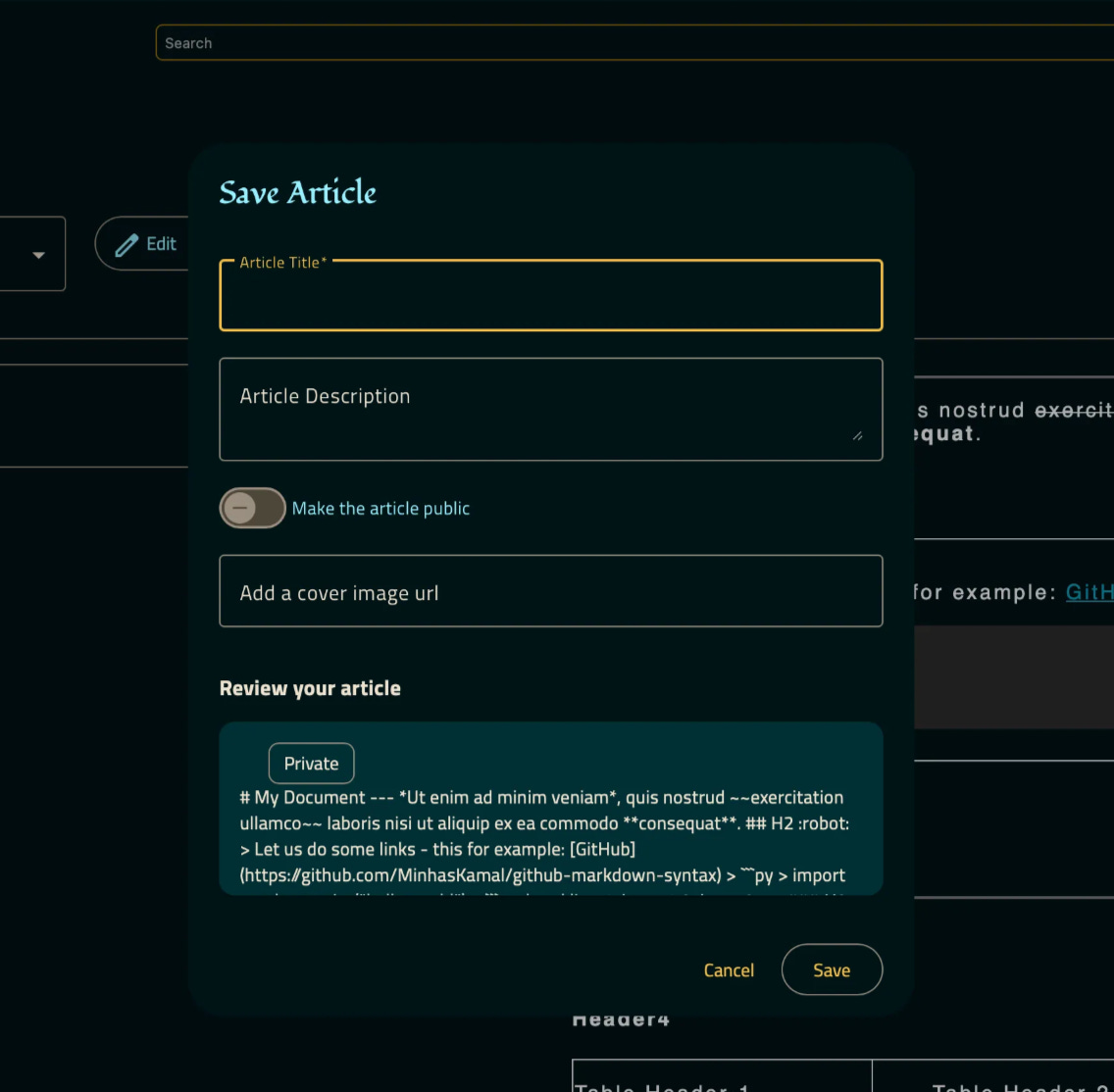
edit-save-article.component.html
<h2 mat-dialog-title>Save Article</h2>
<mat-dialog-content class="mat-typography dialog" >
<!-- The below set of chips displays meta data of the article if an existing article is being edited -->
<mat-chip-set>
@if(this.article.createdBy) {
<mat-chip>
<span
matChipAvatar
class="material-symbols-outlined"
>account_circle</span>
Created By {{this.article.createdBy}}
</mat-chip>
}
@if(this.article.createdAt) {
<mat-chip>
<span
matChipAvatar
class="material-symbols-outlined"
>event</span>
Created At {{this.article.createdAt | date: 'dd MMM YYYY' }}
</mat-chip>
}
@if(this.article.updatedBy) {
<mat-chip>
<span
matChipAvatar
class="material-symbols-outlined"
>account_circle</span>
Updated By {{this.article.updatedBy}}
</mat-chip>
}
@if(this.article.updatedAt){
<mat-chip>
<span
matChipAvatar
class="material-symbols-outlined"
>event</span>
Updated At {{this.article.updatedAt | date: 'dd MMM YYYY' }}
</mat-chip>
}
</mat-chip-set>
<!-- The below form takes inputs that describe the article -->
<form [formGroup]="saveArticleGroup">
<br>
<mat-form-field appearance="outline" style="width: 100%">
<mat-label>Article Title</mat-label>
<input matInput type="text" formControlName="titleControl">
</mat-form-field>
<mat-form-field appearance="outline" style="width: 100%">
<mat-label>Article Description</mat-label>
<textarea matInput type="text" [maxlength]="'400'" formControlName="descControl"></textarea>
</mat-form-field>
<mat-slide-toggle formControlName="publicControl">Make the article public</mat-slide-toggle>
<br>
<br>
<mat-form-field appearance="outline" style="width: 100%">
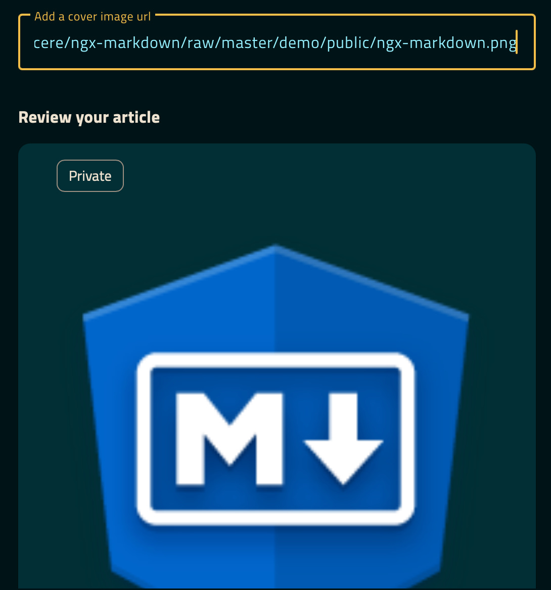
<mat-label>Add a cover image url</mat-label>
<input matInput type="text" formControlName="coverControl">
</mat-form-field>
<!-- The contents of the article are displayed in brief below -->
<h3>Review your article</h3>
<mat-card style="margin: auto;">
<mat-card-header>
<mat-card-title style="display: flex; flex-direction: row; gap: 1em; overflow-wrap: break-word">
<div>{{saveArticleGroup.controls['titleControl'].value}}</div>
@if(saveArticleGroup.controls["publicControl"].value) {<mat-chip style="justify-self: flex-end">Public</mat-chip>}
@else {<mat-chip style="justify-self: flex-end">Private</mat-chip>}
</mat-card-title>
<mat-card-subtitle style="overflow-wrap: break-word">
{{saveArticleGroup.controls['descControl'].value}}
</mat-card-subtitle>
</mat-card-header>
<img mat-card-image src="{{saveArticleGroup.controls['coverControl'].value}}">
<mat-card-content class="wrap-text" style="max-height: 5em; ">
{{this.editService.mdArticle.getValue().content}}
</mat-card-content>
</mat-card>
<br>
</form>
</mat-dialog-content>
<!-- Action buttons to close the save dialog -->
<mat-dialog-actions align="end">
<button mat-button mat-dialog-close>Cancel</button>
<button mat-stroked-button [mat-dialog-close]="true" (click)="saveArticle()">Save</button>
</mat-dialog-actions>
edit-save-article.component.ts
@Component({
    selector: 'app-edit-save-article',
    imports: [
        DatePipe,
        MatCardModule,
        MatChipsModule,
        MatSlideToggleModule,
        MarkdownComponent,
        MatFormFieldModule,
        MatButtonModule,
        MatIconModule,
        EditDialogComponent,
        FormsModule,
        MatDividerModule,
        MatDialogModule,
        MatInputModule,
        ReactiveFormsModule,
        MatListModule
    ],
    templateUrl: './edit-save-article.component.html',
    styleUrl: './edit-save-article.component.scss'
})
export class EditSaveArticleComponent {

  article: Article = new Article(); // Set a new article object
  articleName: String | null = "" // Initially article title and description is not populated
  articleDesc: String | null = ""
  articleTopic = "";
  coverUrl = new FormControl(''); // This form control is to take the cover image's URL as input
  articleCover: String | null = "";
  text: String | null = ""
  style: Style | null = new Style(); // Initially a new Style object is set
  id = ""
  isChecked = false;

  // All the form controls are grouped into a form group
  saveArticleGroup: FormGroup = new FormGroup({
    titleControl: new FormControl("Untitled", [Validators.required]),
    publicControl: new FormControl(false),
    descControl: new FormControl(""),
    coverControl: new FormControl(""),

  });
  constructor(protected editService:EditService, // The edit service is injected to sync the changes in article content and styles
              protected articleService: ArticleService, // The article service will be used to send the post request for creating or updating articles
              private snackBar: MatSnackBar, // A snack bar is used to give a success or failure pop up on saving the article
              private router: Router) {
  }
  ngOnInit(){

    this.editService.mdArticle.subscribe(article => {
      this.article = article;

			// The article from the edit service is used to set all the form field values
      this.saveArticleGroup.controls["titleControl"].setValue(this.article.title);
      this.saveArticleGroup.controls["publicControl"].setValue(this.article.isPublic)
      this.saveArticleGroup.controls["descControl"].setValue(this.article.description);
      this.saveArticleGroup.controls["coverControl"].setValue(this.article.coverURL)
      this.style = article.style;
      console.log("Style in Dialog: ", this.style);
      console.log("Review saved article: ", this.article, this.saveArticleGroup.controls);
      const head = document.getElementsByTagName('head')[0];
      const tempstyle = document.createElement('style');
      tempstyle.type = 'text/css';
      tempstyle.appendChild(document.createTextNode(this.editService.parse()));
      head.appendChild(tempstyle);
    })
  }
  formatDate(date:Date) {
    return date.toDateString()
  }

  // This function is called on clicking the save button
  saveArticle() {

	  // A new article is created from the form inputs provided
    var tempArticle = new Article(this.article.id,
      this.saveArticleGroup.controls["titleControl"].value,
      this.saveArticleGroup.controls["descControl"].value,
      this.article.content,
      this.saveArticleGroup.controls["coverControl"].value,
      this.saveArticleGroup.controls["publicControl"].value,
      this.article.isTrashed,
      this.article.createdAt,
      this.article.updatedAt,
      this.article.createdBy,
      this.article.updatedBy,
      this.style)
    console.log("Saving article: ", this.article);

    // The REST call is made from the article service to save the article
    this.articleService.saveArticle(tempArticle).pipe(catchError((error: any, caught: Observable<any>): Observable<any> => {
      this.snackBar.open("Article was not saved!", "CLOSE", {duration :5000}) // An error message is displayed using the snack bar
      return of();
    })).subscribe(a => {
      var tempA = this.articleService.articles.getValue()
      tempA.push(a)
      this.articleService.articles.next(tempA) // The new article is added to the list of articles present in the article service
      this.router.navigate(["/articles"]) // Navigate to the page of articles
      this.snackBar.open("Article Saved Successfully", "OK", {duration :5000}) // A success message is displayed using the snack bar
      localStorage.removeItem("article"); // Remove the local copy of edited article so that on opening the edit page the screen is clear
      this.editService.mdArticle.next(new Article())
      return of(a)
    });
  }
}
edit-save-article.component.scss
Only basic CSS is present for the alignment of content within the dialogue.
.dialog {
  display: flex;
  flex-direction: column;
}
.wrap-text {
  overflow-wrap: break-word;
  overflow-y: scroll;
  max-height: 80%;
}
Enhancing the Final Preview
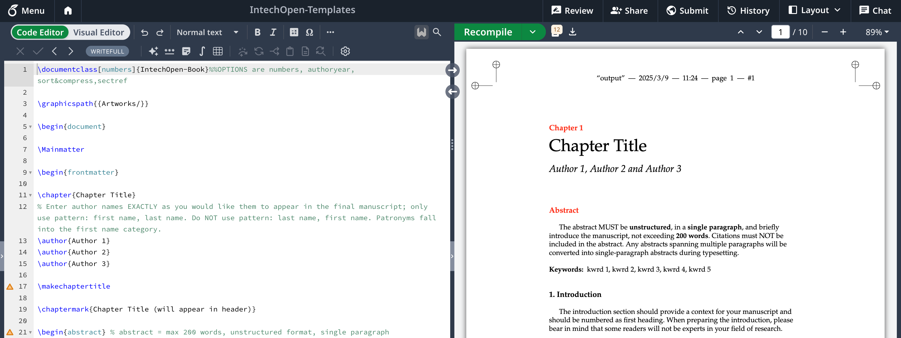
Given that the markdown editor will be used to enter long-form content, users may expect to see a table of contents. While you can always manually add a table of contents to your document, a table of contents generated by parsing the contents of the article is more convenient and accurate.
The image below shows the preview of the expected output from the component that renders the saved article.
Markdown Render Factory
To make more customised renders via the ngx-markdown library, the markdownRenderFactory() can be used.
renderer.headingdefines the callback for rendering all tags fromh1toh6. The returned HTML string from this callback is what will be directly used in the resultant HTML file. Thedepthvariable tells which level of heading the incoming token is from. Thetokensvariable consists of the list of tokens enclosed in the header tag. The tokens can be of different kinds. Consider the tokens for the below rendered line: -

As shown in the below snippet, a single heading consists of two tokens, one is of the text type while the other is of the HTML type as it is an image.
{
	type: "text",
	raw: "H3 ",
	text: "H3 ",
	escaped: false
},
{
	block: false,
	inLink: false,
	inRawBlock: false,
	raw: "<img src=\\"<https://cloud.githubusercontent.com/assets/5456665/13322882/e74f6626-dc00-11e5-921d-f6d024a01eaa.png\\>" height=\\"40px\\"/>",
	text: "<img src=\\"<https://cloud.githubusercontent.com/assets/5456665/13322882/e74f6626-dc00-11e5-921d-f6d024a01eaa.png\\>" height=\\"40px\\"/>",
	type: "html"
}
To support this while rendering the table of contents, the image needs to be removed from the text content. For this, two variables:
textandtextOnlyare used for rendering the tokens by including non-textual tokens and ignoring them.All
h1tags will be added to the table of contents. This is done by aarticleService.addHeading(textOnly)method that takes the rendered content that only includes the text content.The
idattribute of the rendered header tag will be used to navigate to headings within the article.renderer.tabledefines the callback for rendering markdown tables. The input this callback receives looks as follows: -
{
	"header": [
		{text: "Table Header-1", tokens: Array, header: true, align: "left"},
		{text: "Table Header-2", tokens: Array, header: true, align: "center"},
		{text: "Table Header-3", tokens: Array, header: true, align: "right"}
	],
	"rows": [
		[
			{text: "Table Data-1", tokens: Array, header: false, align: "left"},
			{text: "Table Data-2", tokens: Array, header: false, align: "center"},
			{text: "Table Data-3", tokens: Array, header: false, align: "right"}
		],
		[
			{text: "TD-4", tokens: Array, header: false, align: "left"},
			{text: "Td-5", tokens: Array, header: false, align: "center"},
			{text: "TD-6", tokens: Array, header: false, align: "right"}
		]
	]
}
The above input has to be converted into an HTML table.
The
headerattribute is used to decide whether a cell should be rendered as a header cell (<th>) or as a normal cell (<td>)All the cells in a row have to be combined and placed under the
<tr>tag.
renderer.blockquoteis essentially a specially styleddivcontaining more tokens that have to be parsed. Theeditor-bqclass defines the global style of block quotes across the website.Parser.parse(tokens)is used to parse the tokens within the block quote and then place them within the block quote.renderer.imageandrenderer.linkwork similarly by just rendering theimgandatags respectively with specific classes. Additionallyrenderer.imagealso defines what image should be displayed if the specified image cannot be rendered.
Finally, the renderer object with all the above callbacks defined is returned by the factory to render the HTML content.
export function markdownRenderFactory(): MarkedOptions {
  const renderer = new MarkedRenderer();
  const articleService = inject(ArticleService)
  const returnRowHTML = (rowObj:any) => {
    const text = marked.Parser.parse(rowObj.tokens);
    const cellType = rowObj.header ? "h" : "d"
    return `<t${cellType} style="text-align: ${rowObj.align}">${text}</t${cellType}>`
  }
  articleService.resetHeadings()
  renderer.heading = ({tokens, depth}) => {

    const text = marked.Parser.parseInline(tokens);
    const textOnly = marked.Parser.parseInline(tokens.filter(t => t.type == "text"))

    if(depth == 1) {
      articleService.addHeading(textOnly)
    }
    const elem = `<h${depth} class="h${depth}" id="${textOnly.replaceAll(' ','-')}">${text}</h${depth}>`
    return elem;
  }
  renderer.table = (tokens) => {
    var headerRow = ""
    var rows = ""
    for (var h of tokens.header) {
      headerRow += returnRowHTML(h)
    }
    for (var r of tokens.rows) {
      var row = ""
      for (var c of r) {
        row += returnRowHTML(c)
      }
      rows += `<tr>${row}</tr>`
    }
    return `<table class="editor-table">
	    <tr>${headerRow}</tr>
	    ${rows}
		</table>`;
  }
  renderer.blockquote = ({tokens}) => {
    return '<div class="editor-bq">' + Parser.parse(tokens) + '</div>';
  };
  renderer.image = (tokens)=> {
    return `<img class="editor-image" src="${tokens.href}" onerror="this.src='assets/placeholderImage.png'">`;
  }
  renderer.link = (tokens) => {
    return `<a class="editor-link" href="${tokens.href}">${tokens.text}</a>`;
  }

  return {
    renderer: renderer
  };
}
ArticleComponent
The ArticleComponent handles rendering of the editable and viewable article views. It receives the mode input from the parent and renders the correct component accordingly.
article.component.html
@switch(mode) {
  @case(ComponentMode.edit) {
    <app-edit-article [article]="article"></app-edit-article>
  }
  @case(ComponentMode.view) {
    <app-view-article [article]="article"></app-view-article>
  }
}
ViewArticleComponent
view-article.component.html
Earlier, the component responsible for rendering the view only consisted of the following code: -
<markdown
  clipboard
  katex
  emoji
  mermaid
  lineHighlight
  ngPreserveWhitespaces = true
  [clipboardButtonComponent]="clipboardButton"
  [start]="1"
  [data]="this.article.content"
  [innerHTML]="this.htmlContent"
>
  <!--[src]="'<https://cdn.jsdelivr.net/npm/mermaid@10.9.1/dist/mermaid.min.js>'"-->
</markdown>
However, now with there being additional metadata associated with the written content, such as, title, description, a cover image, etc., this metadata also has to be displayed in some form. The below div displays the article’s cover, title and description.
<div class="header-parent">
  <div class="header">
    <div [style.background-image]="'url(' + this.article.coverURL + ')'" class="cover"></div>
    <div class="content">
      <h1>{{this.article.title}}</h1>
    </div>
  </div>
  <h3 style="white-space: pre-wrap;">{{this.article.description}}</h3>
</div>
The table of contents is displayed inside a mat-card.
<mat-card class="toc">
  <mat-card-header>Table of Contents</mat-card-header>
  <mat-selection-list >
    @for(i of tableOfContents; track i) {
      <mat-list-item matTooltip="{{i}}" matTooltipPosition="left">
        <a (click)="updateIndex()" href="{{renderTOCItem(i)}}" class="editor-link">{{i}}</a>
      </mat-list-item>
    }
  </mat-selection-list>
</mat-card>
The complete code is as follows.
<div style="min-height: 85vh">
  <button mat-stroked-button style="margin: 1em;" (click)="goBack()">
    <mat-icon class="material-symbols-outlined">arrow_back</mat-icon>
    Back
  </button>
  <div class="header-parent">
    <div class="header">
      <div [style.background-image]="'url(' + this.article.coverURL + ')'" class="cover"></div>
      <div class="content">
        <h1>{{this.article.title}}</h1>
      </div>
    </div>
    <h3 style="white-space: pre-wrap;">{{this.article.description}}</h3>
  </div>
  <div class="page-content">
    <div class="markdown-container common-class" id="markdown-view">
      <markdown
        clipboard
        katex
        emoji
        mermaid
        lineHighlight
        ngPreserveWhitespaces = true
        [clipboardButtonComponent]="clipboardButton"
        [start]="1"
        [data]="this.article.content"
        [innerHTML]="this.htmlContent"
      >
        <!--[src]="'<https://cdn.jsdelivr.net/npm/mermaid@10.9.1/dist/mermaid.min.js>'"-->
      </markdown>
    </div>
    <mat-card class="toc">
      <mat-card-header>Table of Contents</mat-card-header>
      <mat-selection-list >
        @for(i of tableOfContents; track i) {
          <mat-list-item matTooltip="{{i}}" matTooltipPosition="left">
            <a (click)="updateIndex()" href="{{renderTOCItem(i)}}" class="editor-link">{{i}}</a>
          </mat-list-item>
        }
      </mat-selection-list>
    </mat-card>
  </div>
</div>
<app-comments [itemType]="'article'" [itemID]="article.id!"></app-comments>
view-article.component.ts
Initially, the article’s style is added to the page’s document.
The list of headings in the table of contents is populated by the markdown render factory. This list is fetched using the article service.
The
idof the heading is used to navigate to it in the table of contents. The ID is appended to the URL of the page to get the location of the heading. This URL is provided using therenderTOCItem()function.
@Component({
  selector: 'app-view-article',
  imports: [
    MarkdownComponent,
    MatButton,
    MatCard,
    MatCardHeader,
    MatIcon,
    MatListItem,
    MatSelectionList,
    MatTooltip,
    CommentsComponent
  ],
  templateUrl: './view-article.component.html',
  standalone: true,
  styleUrl: './view-article.component.scss'
})
export class ViewArticleComponent {
  id:string = ""
  @Input() article!: Article
  htmlContent!: string;
  tableOfContents:string[] = []
  basePath  = ""
  subRouteIndex=1
  prevRoute = ""

  constructor(private articleService: ArticleService,
              private router: Router,
              private editService: EditService) {
  }

  ngOnChanges() {
    this.basePath = this.router.url;
      var foundHash = this.basePath.indexOf("#")
      if (foundHash != -1) {
        this.basePath = this.basePath.substring(0, foundHash);
      }
      if (this.article.style) {
        const head = document.getElementsByTagName('head')[0];
        const tempstyle = document.createElement('style');
        tempstyle.type = 'text/css';
        tempstyle.appendChild(document.createTextNode(this.editService.parse(this.article.style)));
        head.appendChild(tempstyle);
      }
      else {
        document.getElementsByTagName("head")[0].removeChild(
          document.getElementsByTagName("style")[0]
        )
      }
      this.articleService.currentArticleHeadings.subscribe(h=>{
        this.tableOfContents = h
      })
  }

  renderTOCItem(i:string){
    return `${this.basePath}#${i.replaceAll(' ','-')}`
  }

  protected readonly clipboardButton = CopyButtonComponent;

  goBack() {
    history.go(-this.subRouteIndex)
    this.articleService.currentArticleHeadings.next([])
  }

  updateIndex() {
    this.subRouteIndex+=1
  }

}
view-article.component.scss
The CSS for this component consists of the basic classes related to the article being rendered as well as the alignment-related settings of the various parts on the page, such as the header, the content body, the table of contents, etc.
.page-content {
  display: flex;
  flex-direction: row;
  align-items: flex-start;
  justify-content: flex-start;
}
.toc {
  width: 25%;
  position: fixed;
  top: 50%;
  right: 0;
}
.header {
  position: relative;
  width: 100%;
  height: 10em;
  max-height: 20em;
  margin: auto;
  border-radius: 1em;
  overflow: hidden;
}
.header-parent {
  position: relative;
  width: 97%;
  max-height: 20em;
  margin: auto;
  border-radius: 1em;
  overflow: hidden;
}
.cover {
  width: 100%;
  height: 100%;
  filter: brightness(0.4);
  position: absolute;
  top: 0;
  background-position: center;
  background-size: cover;
}
.content {
  position: absolute;
  top: 0;
  width: 90%;
  margin-left: 5%;
  height: 100%;
  color: white;
  display: flex;
  flex-direction: column;
  align-items: center;
  justify-content: center;
  font-family: var(--sys-headline-medium-font);
}
.content > h3 {
  overflow: hidden;
  overflow-wrap: anywhere;
  text-overflow: ellipsis;
  display: -webkit-box;
  -webkit-line-clamp: 6;
  line-clamp: 6;
  -webkit-box-orient: vertical;
  text-align: center;
}

@import url("<https://fonts.googleapis.com/css2?family=Noto+Serif:ital,wght@0,100..900;1,100..900&family=Roboto+Mono:ital,wght@0,100..700;1,100..700&family=Roboto+Slab:wght@100..900&display=swap>");

.markdown-container {
  padding: 1em;
  font-family: var(--noto-serif), serif;
  overflow-wrap: break-word;
  width: 80%;
  justify-self: flex-start;
}
blockquote {
  border: 5px solid red;
}
table {
  width: 100%;
  border-collapse: collapse;
  border: 1px solid;
}
#markdown-view {
  width: 60%;
  min-width:15em;
}